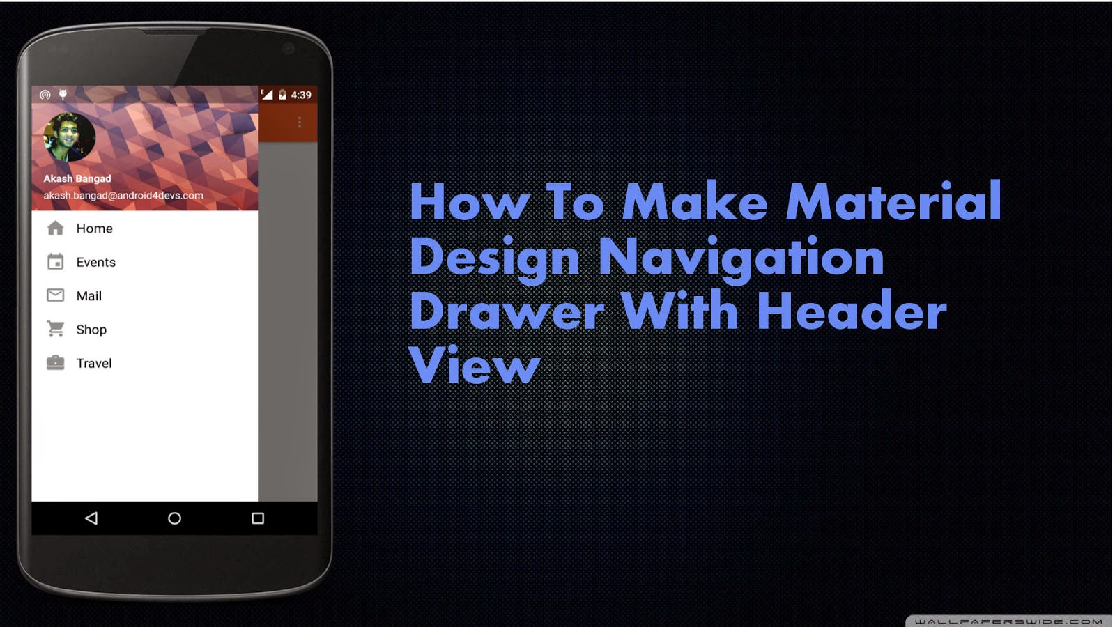
One of the most evident changes when the material design came out and I got my hands on was the new Navigation Drawer, The Hamburger toggle icon animation seemed very beautiful, The Overlapping drawer on status bar also seemed nice effect and so we are going to learn how to make a Navigation Drawer in this tutorial, with that effect and we are going to use the new RecyclerView for making the list view with the header (just like Gmail app's Navigation Drawer) in the sliding drawer, So let's begin.
Prerequisites
Navigation Drawer over the Action Bar/ App Bar we made in the previous post. It isn't completely necessary to read the previous post where I show how to make a material design App Bar but I strongly recommend you to read it once.
Requirements
2. CircleImage Library (which is used in the header view for the profile picture). Add this library in your gradel build by including the following dependency
3. Appcombat v7-21 Support Library As I have explained in my earlier post, If you are running over new Android studio you don't need to add a compiled dependency of appcombat v7 21 as the Android Studio takes care of it. The next thing you need to add in your gradel build is compiled dependency for RecyclerView. To do that add the following line in your build.gradel file.
compile 'com.android.support:recyclerview-v7:21.0.+'
Let's Understand How the Navigation Drawer Works
To make a Navigation Drawer, you have to initiate it in the XML file of the activity on which you want to implement the material design sliding drawer. To initiate the Navigation Drawer we need to use the XML tag as shown below and as with any other view you have to set the layout attributes such as Height, Width, and Id etc. Drawer Layout should have two child views
First Child - Main Content
Steps To Make A Material Design Navigation Drawer
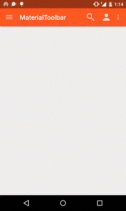
As we are making a navigation drawer over the Action Bar/App Bar we made in the earlier post what we have with us while we start out, looks something like this

Now lets start to code our Navigation Drawer
1. First open up our activity_main.xml file from res folder and add a DrawerLayout as the root view of the app and inside the drawer layout add the App bar which is done by adding the include tag inside the first child of your drawer layout (in my case its the linear layout) now as the drawer layout is your root layout and you have included the App bar inside the drawers first child, all this makes sure the drawer slides over the App bar as we wanted. You would get the clear understanding after you see the layout file.
1 2 3 4 5 6 7 8 9 10 11 12 13 14 15 16 17 18 19 20 21 22 23 24 25 26 27 28 29 30 31 32 33 34 35 36 37 38 39 40 41 42 43 | <?xml version="1.0" encoding="utf-8"?><android.support.v4.widget.DrawerLayout android:id="@+id/DrawerLayout" android:layout_width="match_parent" android:layout_height="match_parent" android:elevation="7dp"> <LinearLayout android:layout_width="match_parent" android:layout_height="match_parent" android:orientation="vertical"> <include android:id="@+id/tool_bar" layout="@layout/tool_bar"> </include> <TextView android:layout_width="wrap_content" android:layout_height="wrap_content" android:text="Hello World" /> </LinearLayout> <android.support.v7.widget.RecyclerView android:id="@+id/RecyclerView" android:layout_width="320dp" android:layout_height="match_parent" android:layout_gravity="left" android:background="#ffffff" android:scrollbars="vertical"> </android.support.v7.widget.RecyclerView></android.support.v4.widget.DrawerLayout> |
1 2 3 4 5 6 7 8 9 10 11 12 13 14 15 16 17 18 19 20 21 22 23 24 25 26 27 | <?xml version="1.0" encoding="utf-8"?> android:layout_width="wrap_content" android:paddingTop="8dp" android:paddingBottom="8dp" android:layout_height="wrap_content" android:background="#ffffff" android:orientation="horizontal"> <ImageView android:layout_width="wrap_content" android:layout_height="wrap_content" android:id="@+id/rowIcon" android:paddingLeft="16dp" android:src="@drawable/ic_launcher"/> <TextView android:layout_width="wrap_content" android:layout_height="wrap_content" android:paddingLeft="12dp" android:paddingTop="4dp" android:textAppearance="?android:attr/textAppearanceMedium" android:text="Medium Text" android:id="@+id/rowText" /></LinearLayout> |
This is how the header.xml looks like.
1 2 3 4 5 6 7 8 9 10 11 12 13 14 15 16 17 18 19 20 21 22 23 24 25 26 27 28 29 30 31 32 33 34 35 36 37 38 39 40 41 42 43 44 45 46 47 48 49 50 51 52 53 | <?xml version="1.0" encoding="utf-8"?> android:layout_width="match_parent" android:layout_height="178dp" android:background="@drawable/background_poly" android:orientation="vertical" android:weightSum="1"> <LinearLayout android:layout_width="match_parent" android:layout_height="56dp" android:orientation="vertical" android:layout_alignParentBottom="true" android:layout_alignParentLeft="true" android:layout_alignParentStart="true"> <TextView android:id="@+id/name" android:layout_width="wrap_content" android:layout_height="wrap_content" android:layout_marginLeft="16dp" android:textColor="#ffffff" android:text="Akash Bangad" android:textSize="14sp" android:textStyle="bold" /> <TextView android:id="@+id/email" android:layout_width="wrap_content" android:layout_height="wrap_content" android:textColor="#ffffff" android:layout_marginLeft="16dp" android:layout_marginTop="5dp" android:text="akash.bangad93@gmail.com" android:textSize="14sp" android:textStyle="normal" /> </LinearLayout> <de.hdodenhof.circleimageview.CircleImageView android:layout_width="70dp" android:layout_height="70dp" android:src="@drawable/aka" android:layout_marginLeft="16dp" android:layout_marginTop="38dp" android:id="@+id/circleView" /></RelativeLayout> |
1 2 3 4 5 6 7 8 9 10 11 12 13 14 15 16 17 18 19 20 21 22 23 24 25 26 27 28 29 30 31 32 33 34 35 36 37 38 39 40 41 42 43 44 45 46 47 48 49 50 51 52 53 54 55 56 57 58 59 60 61 62 63 64 65 66 67 68 69 70 71 72 73 74 75 76 77 78 79 80 81 82 83 84 85 86 87 88 89 90 91 92 93 94 95 96 97 98 99 100 101 102 103 104 105 106 107 108 109 110 111 112 113 114 115 116 117 | package com.android4devs.navigationdrawer;import android.support.v4.widget.DrawerLayout;import android.support.v7.app.ActionBarActivity;import android.os.Bundle;import android.support.v7.app.ActionBarDrawerToggle;import android.support.v7.widget.LinearLayoutManager;import android.support.v7.widget.RecyclerView;import android.support.v7.widget.Toolbar;import android.view.Menu;import android.view.MenuItem;import android.view.View;public class MainActivity extends ActionBarActivity { //First We Declare Titles And Icons For Our Navigation Drawer List View //This Icons And Titles Are holded in an Array as you can see String TITLES[] = {"Home","Events","Mail","Shop","Travel"}; int ICONS[] = {R.drawable.ic_home,R.drawable.ic_events,R.drawable.ic_mail,R.drawable.ic_shop,R.drawable.ic_travel}; //Similarly we Create a String Resource for the name and email in the header view //And we also create a int resource for profile picture in the header view String NAME = "Akash Bangad"; String EMAIL = "akash.bangad@android4devs.com"; int PROFILE = R.drawable.aka; private Toolbar toolbar; // Declaring the Toolbar Object RecyclerView mRecyclerView; // Declaring RecyclerView RecyclerView.Adapter mAdapter; // Declaring Adapter For Recycler View RecyclerView.LayoutManager mLayoutManager; // Declaring Layout Manager as a linear layout manager DrawerLayout Drawer; // Declaring DrawerLayout ActionBarDrawerToggle mDrawerToggle; // Declaring Action Bar Drawer Toggle @Override protected void onCreate(Bundle savedInstanceState) { super.onCreate(savedInstanceState); setContentView(R.layout.activity_main); /* Assinging the toolbar object ot the view and setting the the Action bar to our toolbar */ toolbar = (Toolbar) findViewById(R.id.tool_bar); setSupportActionBar(toolbar); mRecyclerView = (RecyclerView) findViewById(R.id.RecyclerView); // Assigning the RecyclerView Object to the xml View mRecyclerView.setHasFixedSize(true); // Letting the system know that the list objects are of fixed size mAdapter = new MyAdapter(TITLES,ICONS,NAME,EMAIL,PROFILE); // Creating the Adapter of MyAdapter class(which we are going to see in a bit) // And passing the titles,icons,header view name, header view email, // and header view profile picture mRecyclerView.setAdapter(mAdapter); // Setting the adapter to RecyclerView mLayoutManager = new LinearLayoutManager(this); // Creating a layout Manager mRecyclerView.setLayoutManager(mLayoutManager); // Setting the layout Manager Drawer = (DrawerLayout) findViewById(R.id.DrawerLayout); // Drawer object Assigned to the view mDrawerToggle = new ActionBarDrawerToggle(this,Drawer,toolbar,R.string.openDrawer,R.string.closeDrawer){ @Override public void onDrawerOpened(View drawerView) { super.onDrawerOpened(drawerView); // code here will execute once the drawer is opened( As I dont want anything happened whe drawer is // open I am not going to put anything here) } @Override public void onDrawerClosed(View drawerView) { super.onDrawerClosed(drawerView); // Code here will execute once drawer is closed } }; // Drawer Toggle Object Made Drawer.setDrawerListener(mDrawerToggle); // Drawer Listener set to the Drawer toggle mDrawerToggle.syncState(); // Finally we set the drawer toggle sync State } @Override public boolean onCreateOptionsMenu(Menu menu) { // Inflate the menu; this adds items to the action bar if it is present. getMenuInflater().inflate(R.menu.menu_main, menu); return true; } @Override public boolean onOptionsItemSelected(MenuItem item) { // Handle action bar item clicks here. The action bar will // automatically handle clicks on the Home/Up button, so long // as you specify a parent activity in AndroidManifest.xml. int id = item.getItemId(); //noinspection SimplifiableIfStatement if (id == R.id.action_settings) { return true; } return super.onOptionsItemSelected(item); }} |
1 2 3 4 5 6 7 8 9 10 11 12 13 14 15 16 17 18 19 20 21 22 23 24 25 26 27 28 29 30 31 32 33 34 35 36 37 38 39 40 41 42 43 44 45 46 47 48 49 50 51 52 53 54 55 56 57 58 59 60 61 62 63 64 65 66 67 68 69 70 71 72 73 74 75 76 77 78 79 80 81 82 83 84 85 86 87 88 89 90 91 92 93 94 95 96 97 98 99 100 101 102 103 104 105 106 107 108 109 110 111 112 113 114 115 116 117 118 119 120 121 122 123 124 125 126 127 128 129 130 131 132 133 134 135 136 137 138 139 140 141 142 143 144 145 146 147 148 149 150 151 | package com.android4devs.navigationdrawer;import android.support.v7.widget.RecyclerView;import android.view.LayoutInflater;import android.view.View;import android.view.ViewGroup;import android.widget.ImageView;import android.widget.TextView;import android.widget.Toast;/** * Created by hp1 on 28-12-2014. */public class MyAdapter extends RecyclerView.Adapter<MyAdapter.ViewHolder> { private static final int TYPE_HEADER = 0; // Declaring Variable to Understand which View is being worked on // IF the view under inflation and population is header or Item private static final int TYPE_ITEM = 1; private String mNavTitles[]; // String Array to store the passed titles Value from MainActivity.java private int mIcons[]; // Int Array to store the passed icons resource value from MainActivity.java private String name; //String Resource for header View Name private int profile; //int Resource for header view profile picture private String email; //String Resource for header view email // Creating a ViewHolder which extends the RecyclerView View Holder // ViewHolder are used to to store the inflated views in order to recycle them public static class ViewHolder extends RecyclerView.ViewHolder { int Holderid; TextView textView; ImageView imageView; ImageView profile; TextView Name; TextView email; public ViewHolder(View itemView,int ViewType) { // Creating ViewHolder Constructor with View and viewType As a parameter super(itemView); // Here we set the appropriate view in accordance with the the view type as passed when the holder object is created if(ViewType == TYPE_ITEM) { textView = (TextView) itemView.findViewById(R.id.rowText); // Creating TextView object with the id of textView from item_row.xml imageView = (ImageView) itemView.findViewById(R.id.rowIcon);// Creating ImageView object with the id of ImageView from item_row.xml Holderid = 1; // setting holder id as 1 as the object being populated are of type item row } else{ Name = (TextView) itemView.findViewById(R.id.name); // Creating Text View object from header.xml for name email = (TextView) itemView.findViewById(R.id.email); // Creating Text View object from header.xml for email profile = (ImageView) itemView.findViewById(R.id.circleView);// Creating Image view object from header.xml for profile pic Holderid = 0; // Setting holder id = 0 as the object being populated are of type header view } } } MyAdapter(String Titles[],int Icons[],String Name,String Email, int Profile){ // MyAdapter Constructor with titles and icons parameter // titles, icons, name, email, profile pic are passed from the main activity as we mNavTitles = Titles; //have seen earlier mIcons = Icons; name = Name; email = Email; profile = Profile; //here we assign those passed values to the values we declared here //in adapter } //Below first we ovverride the method onCreateViewHolder which is called when the ViewHolder is //Created, In this method we inflate the item_row.xml layout if the viewType is Type_ITEM or else we inflate header.xml // if the viewType is TYPE_HEADER // and pass it to the view holder @Override public MyAdapter.ViewHolder onCreateViewHolder(ViewGroup parent, int viewType) { if (viewType == TYPE_ITEM) { View v = LayoutInflater.from(parent.getContext()).inflate(R.layout.item_row,parent,false); //Inflating the layout ViewHolder vhItem = new ViewHolder(v,viewType); //Creating ViewHolder and passing the object of type view return vhItem; // Returning the created object //inflate your layout and pass it to view holder } else if (viewType == TYPE_HEADER) { View v = LayoutInflater.from(parent.getContext()).inflate(R.layout.header,parent,false); //Inflating the layout ViewHolder vhHeader = new ViewHolder(v,viewType); //Creating ViewHolder and passing the object of type view return vhHeader; //returning the object created } return null; } //Next we override a method which is called when the item in a row is needed to be displayed, here the int position // Tells us item at which position is being constructed to be displayed and the holder id of the holder object tell us // which view type is being created 1 for item row @Override public void onBindViewHolder(MyAdapter.ViewHolder holder, int position) { if(holder.Holderid ==1) { // as the list view is going to be called after the header view so we decrement the // position by 1 and pass it to the holder while setting the text and image holder.textView.setText(mNavTitles[position - 1]); // Setting the Text with the array of our Titles holder.imageView.setImageResource(mIcons[position -1]);// Settimg the image with array of our icons } else{ holder.profile.setImageResource(profile); // Similarly we set the resources for header view holder.Name.setText(name); holder.email.setText(email); } } // This method returns the number of items present in the list @Override public int getItemCount() { return mNavTitles.length+1; // the number of items in the list will be +1 the titles including the header view. } // Witht the following method we check what type of view is being passed @Override public int getItemViewType(int position) { if (isPositionHeader(position)) return TYPE_HEADER; return TYPE_ITEM; } private boolean isPositionHeader(int position) { return position == 0; }} |
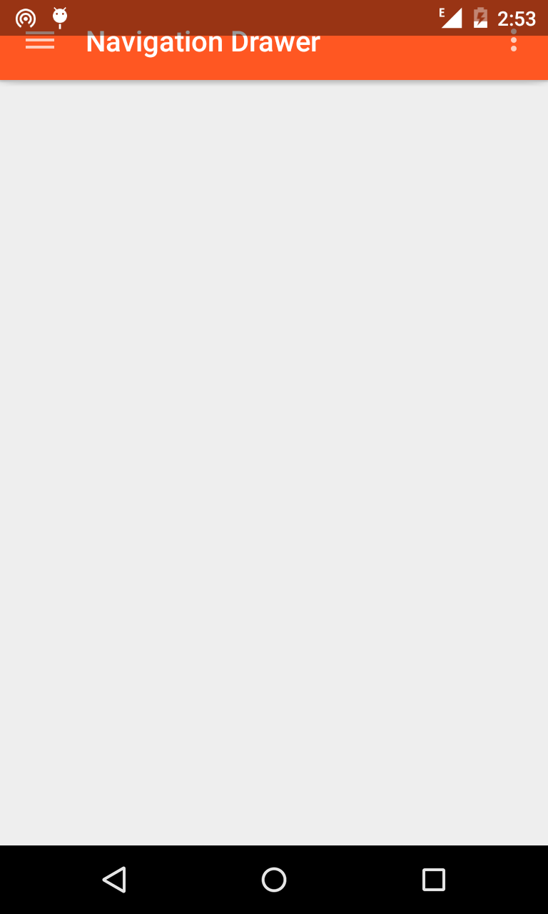
Now if you run the app this is what you would see

Before we get to making the status bar translucent and having our drawer slide below it I must tell you the method you are going to see isnt exactly the right way to implement the above effect as if we want the drawer to slide below the status bar we have to make the status bar translucent and once we make it translucent we can not assign any color to the status bar. You would understand what I am talking about in just a minute
First let me tell you that the status bar translucent method is not available for pre kitkat devices, so we make two styles.xml files one for version 19 api (kitkat) and one for Version 21 api (Lollipop). so in all we have three styles.xml files.
we now add the following styles to both our styles.xml files i.e style for kitkat and lollipop
here is how the style.xml file look for both the files.
1 |
1 2 3 4 5 6 7 8 | <?xml version="1.0" encoding="utf-8"?><resources> <style name="AppTheme" parent="Theme.AppCompat.Light.NoActionBar" > <item name="android:windowTranslucentStatus">true</item> </style></resources> |
Now if you look at the app this is what you are going to see
As you can see we have got the translucent status bar but the toolbar got below it and if you add the android:fitSystemWindows="true" tag in your activity_main.xml as a property to the root layout( DrawerLayout) file the toolbar will move down and adjust to the status bar but even if we get the toolbar down we won't be able to change the color of the status bar once it is set to translucent. now as i have earlier said this is not the exact method to do this, if you look at the stack overflow discussion here you could find that to achieve the above effect you have to use scrimInsetFrameLayout which i dont belive is really very complicated for this effect
So what I do is I have added a padding of 24dp to the tool_bar.xml and as I only want the padding to take effect on kitkat and lollipop devices I have made two dimens files with version api set to 19 and 21 for kitkat and lollipop respectevely and for the pre lollipop devices I have set 0dp padding in the 3rd dimens file, then I have added the padding top to tool_bar.xml
so finally this is how tool_bar.xml looks
1 2 3 4 5 6 7 8 9 10 11 12 13 | <?xml version="1.0" encoding="utf-8"?> android:layout_width="match_parent" android:layout_height="wrap_content" android:background="@color/ColorPrimary" android:theme="@style/ThemeOverlay.AppCompat.Dark" android:elevation="4dp" android:paddingTop="@dimen/tool_bar_top_padding" ></android.support.v7.widget.Toolbar> |
Now everything is done and set and if you open the app this is what you would get
Perfect it looks just the way wanted it to be, So that's how you make a Material design Navigation Drawer which has a Hamburger Toggle icons animating into arrow. If you liked this post please comment and share the post on your social networks.
EDIT: head over to Recycler View : Handling OnItemTouch For Navigation Drawer post if you want to learn how to handle the click events for navigation drawer.
'나의 플랫폼 > 안드로이드' 카테고리의 다른 글
| [Android] Nested RecyclerView 만들기 (4) | 2015.11.26 |
|---|---|
| [Android] Argument for @NotNull parameter 'aFileName' of com/intellij/openapi/util/io/FileUtil.toSystemIndependentName must not be null (0) | 2015.11.25 |
| [Android][스크랩] Android M에 적용될 배터리 절약 모드 Doze! 어떻게 달라질까? (0) | 2015.11.25 |
| [Android] Theme.AppCompat 사용시, statusbar가 UI와 겹칠때 (2) | 2015.11.23 |
| [Android] Activity 호출 시, Wake Lock 관련 테스트 (0) | 2015.11.23 |